Go Go!: Redefining the Mobile Ordering Experience
The project: a innovative way to reduce ordering time for users
As humans we’ve all ordered off of delivery applications. Whether it be something familiar, something unique, by ourselves, or with our friends. Some of us find this to be a rare occasion like when we travel to a new city. Many of us use these to signal the end of the week, or to celebrate a form of routine.
For the first portfolio project I created in completion of my UX Certificate with Google, I came up with Go Go! A mobile app with experiences for users who order by themselves, and users who order for groups.
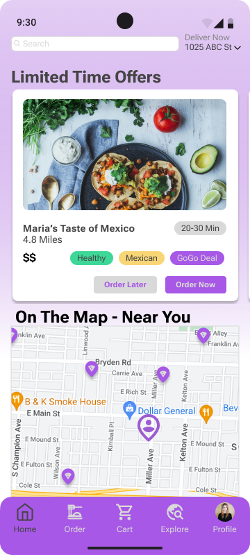
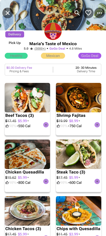
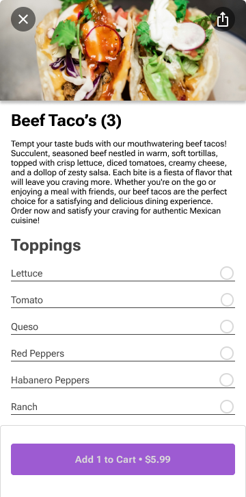
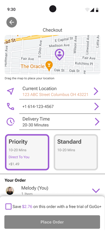
Key frames of GoGo! Showing the fast ordering process available to users
User Research: Empathizing with users of all backgrounds
I began my research by conducting interviews with users in order to develop personas. I wanted to see how people across 5-6 interviewees interacted with mobile ordering applications. I wanted to see what they frequently ordered, what they tended to use, what they had pain points with, and how I could make a unique product. I learned to listen, sit back, and hear about other’s experiences with ordering. Through this experience I learned that everyone’s experiences are different. Some people only used specific food delivery applications, while others used many, even had rewards incentive programs they joined. With these interviews, I synthesized two personas. Alkari and Melody.
User Research: Four major pain points
Discovery: Solo dining users wanted options to find new restaurants, deals and fast options when ordering. Users who tend to order when in groups wanted to quickly see what they routinely order and order again.
Financial: Group users often wanted options to split orders into different itemized items, and pay separately instead of using one person's account.
Usability: Both groups found that finding promotions and close by restaurants currently are difficult when using ordering applications.
Product: Both groups want to see where exactly the restaurants they’re ordering from are located based on their location.
User PERSONAS: Identifying who I’m designing for
Synthesizing the data from the research interviews I conducted, I created two distinct personas, Alkari and Melody. Both personified the two main groups I was aiming. Solo Users and Group order Users. These painted a picture of who I would be designing for, what they are using ordering apps for, and how I can design a better mobile ordering experience for each.
Alkari represents the users who enjoy ordering for themselves
Melody represents the users who enjoy ordering for many people
User Flow: How to get the persona’s to a successful order
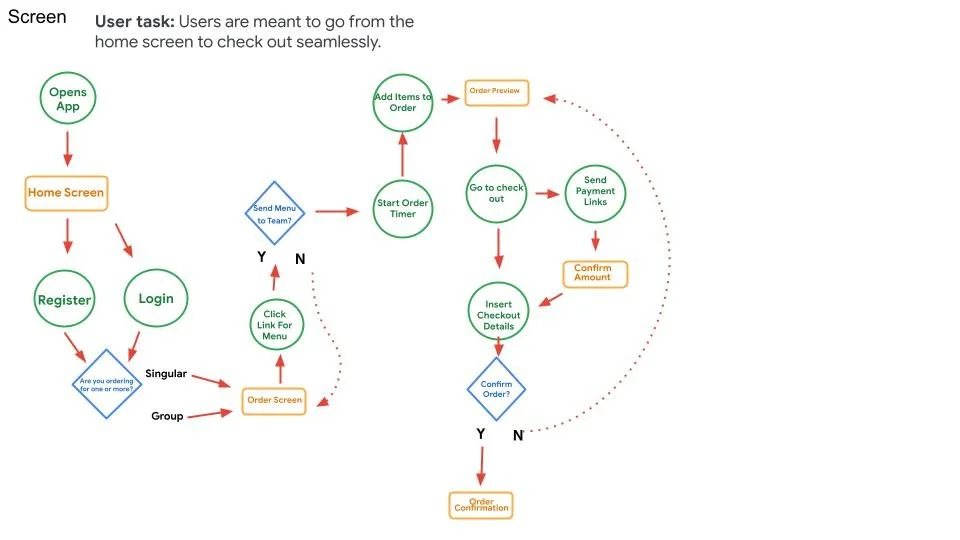
I quickly came up with a journey map based on the research findings that I had. This was to give me a clear direction of what I was designing for, and how I would get there.
The roadmap of how I am going to get users from the opening of the application to a completed order
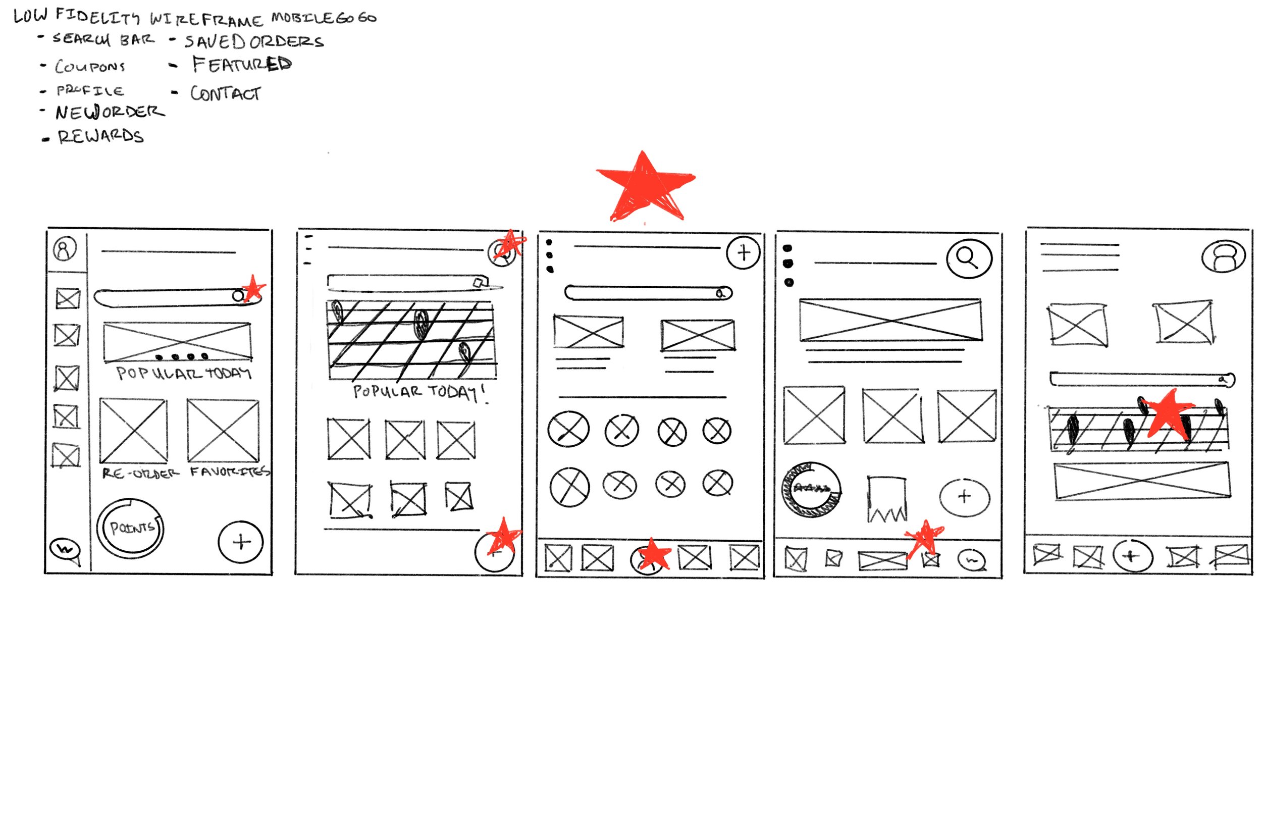
Creating the product: From Paper to Prototype
I allowed myself to be as imaginative as possible about what an ordering screen and home page would look like. I used references from other applications I’d seen overtime and that I had used myself. I wanted to replicate the experiences and features I find enjoyable, like Uber Eats and Instagram! As I learned how to use tools like Figma, I learned how to put the ideas together into workable frames. I learned what could be developed and what was unrealistic as I went through the process of designing my prototypes.
Putting in the work: Identifying key features, product options, and interactions users will have.
Learning the tools of the trade: This is my first attempt at prototyping. I learned to think through experiences I have had before, and what is common based on competitive audits and put the product into frame. I also considered what I found during my discovery phase of the process.
From Feedback to Product: Creating a highly functional prototype in which users can test the features and experiences I refined on after feedback from user testing.
Implementing a Design System: The shaping of GoGo!’s brand
I knew that what I wanted to accomplish for this project was at large. I pushed myself to think of all aspects of the user experience, including the design system. I read and studied many different approaches to building a design system. I wanted to make sure that the design was noticeable, easy to replicate, and easily edited overtime.
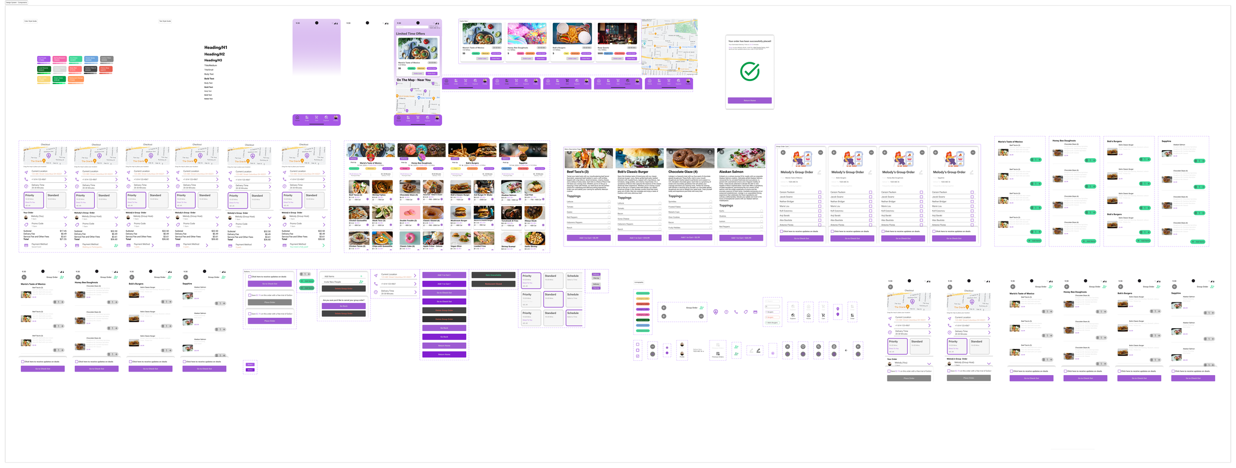
I followed the readings of Atomic Design, by Brad Frost. I created single pieces, which I compiled together into complex shapes, and ultimately total screens. With a uniform design system I was able to complete my project much faster over time, and with less screens. Eliminating excess design time and increasing my prototyping speed. Breaking design components down to their finest parts allowed me to build a design system that anyone can look at, and replicate in future iterations of GoGo!
Building the pieces: Over time the component library grew vast. I organized various components into buttons, cards, sheets, and overlays.
Testing the product: What the User experience turned out to be
The most exciting part of the project is testing the results. What did my test group think of the ordering experience that I had made for them. What features did they like, what accessibility considerations can I make, and what were the impacts of my project. They key indicators of success I used were these 5 metrics;
Use of Navigation - Which method did users prefer, the deal cards or interactive maps?
Conversion Rates - How many users successfully completed an order?
User Error Rates - How many users couldn’t complete the tasks of ordering for themselves or for their group?
System Usability Scale - On a scale of 0-100%, how successful each user was at completing assigned tasks based on a set of questions I asked during the usability study
The Impact of my work: The voice of the User
“I love the addition of the map feature. This makes understanding where restaurants are, if they’re local, and how much they cost so easy to see and understand. I feel like I won’t mess up my order, or order from a location that is so far away it’s not enjoyable for anyone involved.”
”Seeing where participating restaurants are located based on where I live makes me feel connected to my community. If I want to walk to a location, or have items delivered, I can see that on GoGo!’s map!”
“Having a group order button in my cart section makes it easy to toggle between when I order for myself and when I am ordering for a group.”
“I love that the application will let me know when my friends have paid. It makes the check out process so easy!”
”It is cool to see what deals are on the front page of the app. It makes looking quick and easy if I were to use this product.”
”The notifications of when menu items aren’t available are convenient, I like how the categories stand out when I am searching for specific food.”
Tallying the Results: Performance Impact
Based on the 6 users who participated in my study, I found compelling results that what I had made, and the product I was designing worked.
4 of the 6 participants used the map feature, 2 chose the cards as an option first
6 out of 6 participants completed an order at one of the four available restaurants
4 out of 6 users struggled pressing the add button on the menu items available
70% of the users were able to answer the System Usability Scale questions during the usability study
The next steps: What I learned, and how I became a better designer
I learned how to design my own design system. I created components, live mock ups, and how to conduct user testing. Using a design system saves time when designing, and ensures continuity when making products. I learned that I am capable of designing fun, engaging experiences for users that also are useful. This project gave me a great understanding of what it means to be a UX designer professionally. I learned to embrace discovery, empathize with users, find what works, and how I can design and solve specific concerns users have in the mobile ordering industry.
GoGo! has been a launching pad for me to understand what it is like for me as a designer. I worked on all facets of the design process, created the deadlines, and gathered my insights. Turning these into tangible results has been rewarding. I feel I have been able to make a product that is useful, useable, enjoyable, and equitable.
If you’d like a copy of this presentation, the results of the case study are found here
